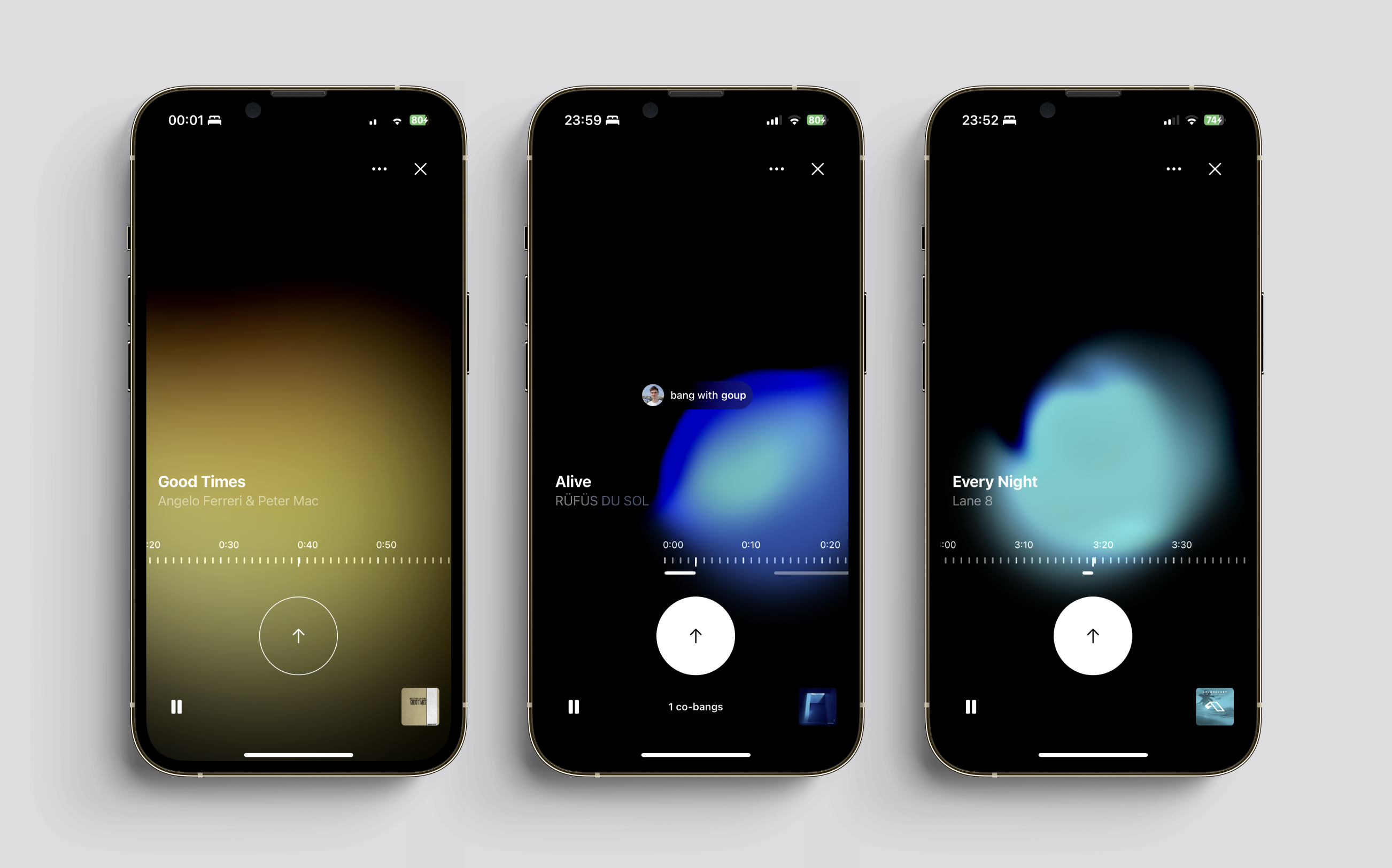
Bang
A music app where users mark exact moments in songs and connect with others who feel the same way.
Designed a new experience in the music industry with precise fragment likes. Made it easier to jump into the experience with streaming service integration and instant results.
Precise likes
The main CTA uses a tap-and-hold gesture, letting users save their favourite fragment and making each like more precise.
Music onboarding
The onboarding is split into simple steps with micro-transitions, syncing the user’s music library and surfacing music buddy recommendations.
Concepts
The wireframing process started. Here you could use the whole screen as a +/- button to select the like/dislike fragments. When the prototype was created it turned out you could accidentally tap on the screen while just holding your phone or when picking it up from the table. It led to mistouch and weird behaviour.
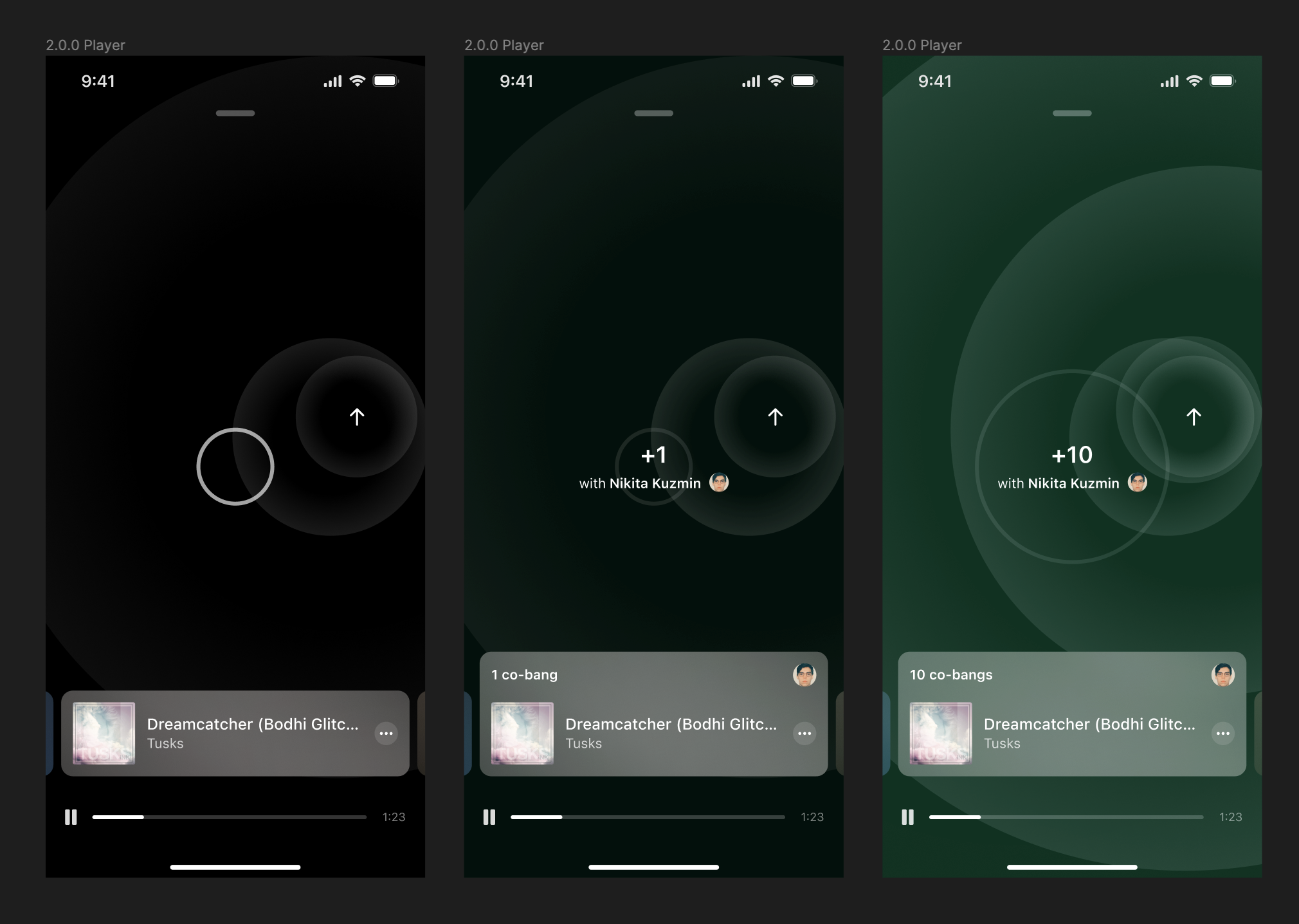
Using buttons
So it led to create regular buttons for the player interface. And for MVP or 1.0 it could be just 'Like/Up/Bang' button. Using this layout in real life in a prototype it turned out you have to reach your finger too far from the bottom. It is not comfortable if you want to scroll through the playback slider.
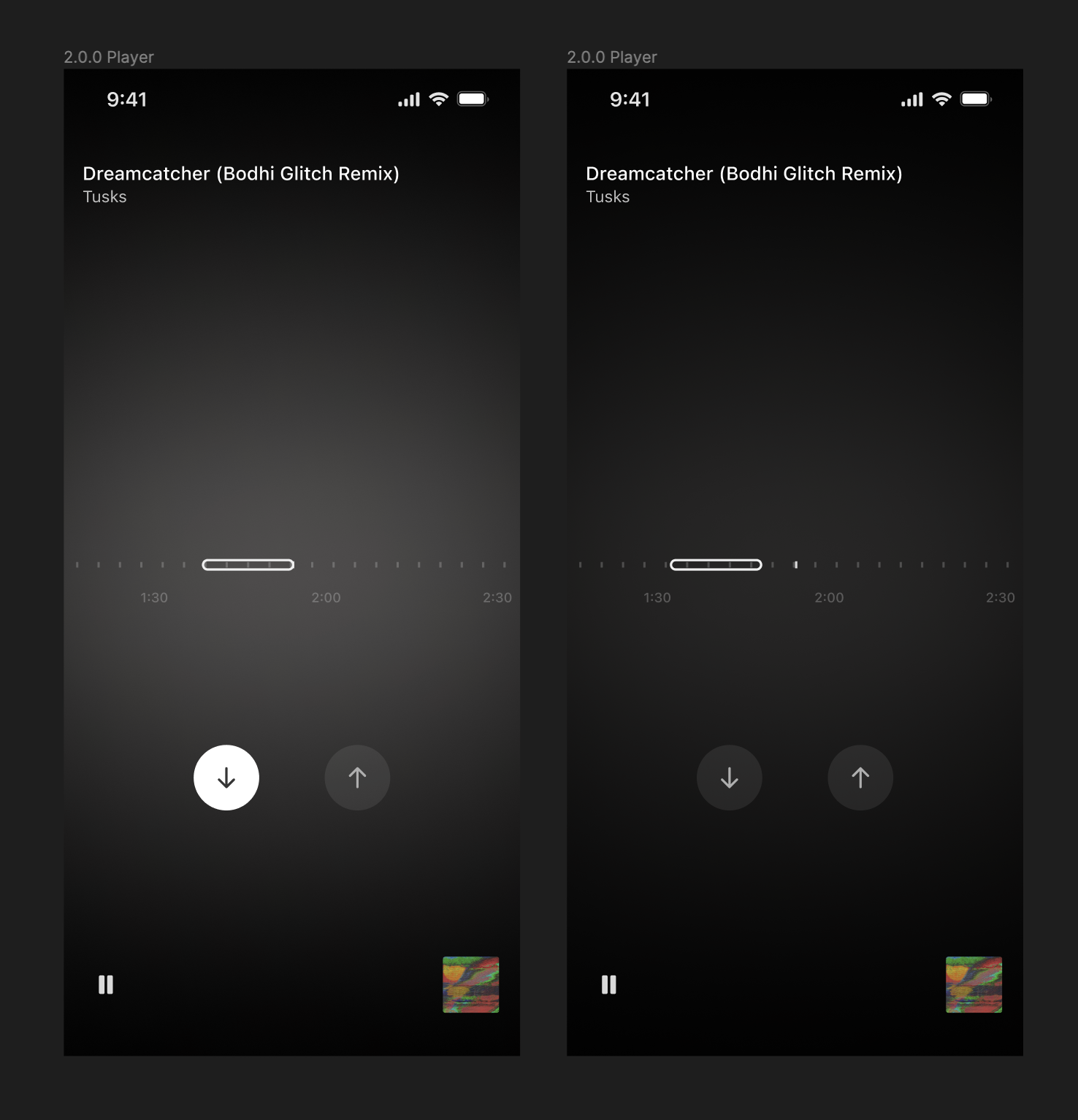
Testing visuals and CPU
Here Soundcloud was used as the main reference. The new visuals used the average color of the artwork to create a continuously generating background. The controls remained the same but were relocated to the bottom for better usability. In the default mode, the background was blurred and very formless. On tap, the background was zoomed out and less blurred. However, it led to some issues with the app's performance: it required up to 40-65% CPU every second and the phone heated up. Another thing was to get rid of that scrollable slider hiding the track's selected fragments (white bars showing the selected fragment).